


Hello, everyone. Creating and using modals is very important in many web applications. So today we will learn how to make a modal using Tailwind CSS and the Headless UI library.
Set Up & Clean Up
Create a new Next JS app with Tailwind CSS:
# npm
npx create-next-app --example with-tailwindcss with-tailwindcss-app

# Yarn
yarn create next-app --example with-tailwindcss with-tailwindcss-app
After that, install all the dependencies we will use:
# npm
npm i @headlessui/react

# Yarn
yarn add @headlessui/react
Then inside our app, you can delete everything inside of index.js and add the following:
const HomePage = () => {
  return (
    <div>
      <Head>
        <title>Modal Headless UI Demo</title>
        <link rel="icon" href="/favicon.ico" />
      </Head>

      <Modal />
    </div>
  )
}
Building the Modal
Creating the Modal
The first thing we should do is create a directory called components and create a new component for our modal. It would be best to name it Modal.js. Then inside the file create a new React functional component and export it (preferable use a snippets extension.
const Modal = () => {
  return <div>The Modal is Here!</div>
}

export default Modal
Now we can render it in our index.js file:
<div>
  {/* Head Component things */}

  <Modal />
</div>
Using the Dialog Component
Dialogs, a pre-built component that comes from Headless UI, will be the main tool we will use to build our modal. Dialogs are built using the Dialog, Dialog.Overlay, Dialog.Title, and Dialog.Description components. We first should build some state to track whether our Dialog is open or closed.
const [open, setOpen] = useState(false)
Now lets create the Dialog component. The component has an open prop, which will track whether to render the Dialog contents onto the page or not. It has an onClose prop, which will run a function when the user clicks out of the modal. It also has a as prop, which will tell Next JS how to render the component (i.e. a div tag, a main tag, etc.).
In our case, the open state will manage the open prop, and we will render our modal as a div. We will simply set the open state to false when we click out of it.
<Dialog open={open} onClose={() => setOpen(false)}></Dialog>
Modals are typically rendered on top of a transparent background. The Dialog.Overlay component can be used and styled to achieve the specific look.
<Dialog open={open} onClose={() => setOpen(false)}>
  <Dialog.Overlay className="fixed inset-0" />
</Dialog>
The Dialog.Title and Dialog.Description components are there to add accessibility to your modal (to make it more visible). They are automatically linked to the root Dialog component through the aria-labelledby and aria-describedby attributes, which will be annonuced to users that are using screen readers.
<Dialog.Title>Update Sucessful</Dialog.Title>
<Dialog.Description>
  Profile updated successfully ✅
</Dialog.Description>
Now there really isn't anything special behind styling the modal; just use the styles you want to use. Usually modals will be centered on the screen and have a maximum width constraint. Here is a span tag you will use to trick the browser into centering the modal contents onto the screen:
<span className="inline-block h-screen align-middle" aria-hidden="true">
​
</span>
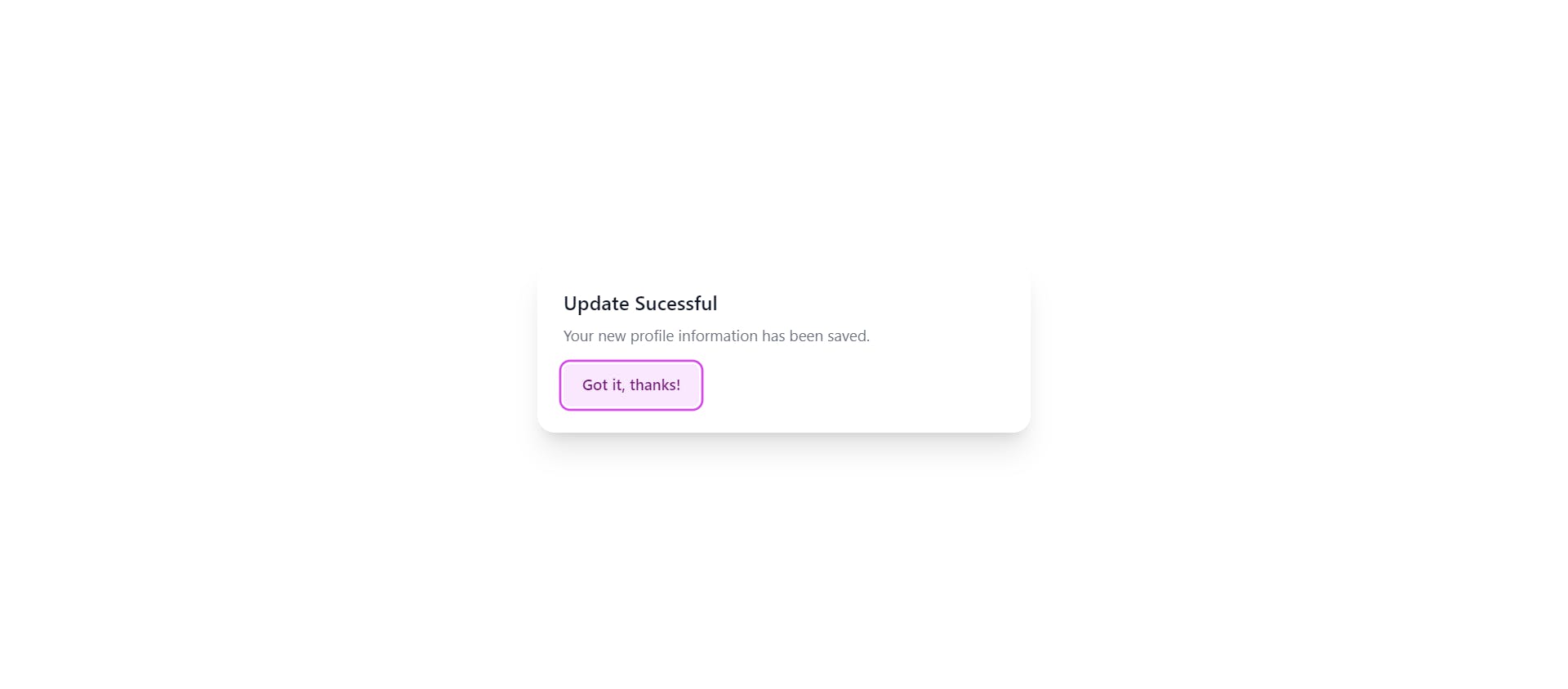
Now I used and tweaked some styles from the documentation to create the following modal that you would probably use when updating some info:
<Dialog
as="div"
className="fixed inset-0 z-10 overflow-y-auto"
onClose={() => setOpen(false)}
>
<div className="min-h-screen px-4 text-center">
<Dialog.Overlay className="fixed inset-0" />
<span className="inline-block h-screen align-middle" aria-hidden="true">
​
</span>
<div className="my-8 inline-block w-full max-w-md transform overflow-hidden rounded-2xl bg-white p-6 text-left align-middle shadow-xl transition-all">
<Dialog.Title
as="h3"
className="text-lg font-medium leading-6 text-gray-900"
>
Update Sucessful
</Dialog.Title>
<div className="mt-2">
<p className="text-sm text-gray-500">
Profile Information Sucessfully Updated and Saved
</p>
</div>
<div className="mt-4">
<button
type="button"
className="inline-flex justify-center rounded-md border border-transparent bg-blue-100 px-4 py-2 text-sm font-medium text-blue-900 hover:bg-blue-200 focus:outline-none focus-visible:ring-2 focus-visible:ring-blue-500 focus-visible:ring-offset-2"
onClick={() => setOpen(false)}
>
Got it, thanks!
</button>
</div>
</div>
</div>
</Dialog>
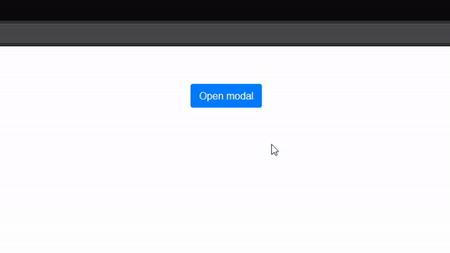
The modal should look like this:
Now you should also have a button that you can use to open and close the modal (you can also close the modal by clicking outside of the screen). When you click it, you can set the open state to true.
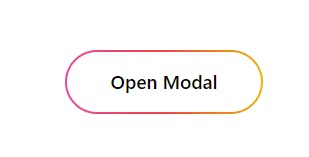
<div className="fixed inset-0 flex items-center justify-center">
  <a
    onClick={() => setOpen(true)}
    className="inline-block cursor-pointer rounded-full bg-gradient-to-r from-pink-500 via-red-500 to-yellow-500 p-[2px] hover:text-white focus:outline-none focus:ring active:text-opacity-75"
  >
    <span className="block rounded-full bg-white px-8 py-3 text-sm font-medium hover:bg-transparent">
      Open Modal
    </span>
  </a>
</div>
Here is how the modal button should look:
Using Transition to make things fancier
You can use the Transition component, that coincidentially also comes from Headless UI, to animate the opening and closing animations of the modal. First, you need to wrap the Dialog component in a Transition component. The show prop is basically the open state.
<Transition
  show={open}
  enter="transition duration-100 ease-out"
  enterFrom="transform scale-95 opacity-0"
  enterTo="transform scale-100 opacity-100"
  leave="transition duration-75 ease-out"
  leaveFrom="transform scale-100 opacity-100"
  leaveTo="transform scale-95 opacity-0"
>
  <Dialog
    as="div"
    className="fixed inset-0 z-10 overflow-y-auto"
    onClose={() => setOpen(false)}
  >
    <div className="min-h-screen px-4 text-center">
      <Dialog.Overlay className="fixed inset-0" />

      {/* ... */}
    </div>
  </Dialog>
</Transition>
The styles that are used in the Transition component usually stay the same, but you can change them as you please. The enterFrom and leaveTo props are the same, and the enterTo and leaveFrom props are the same.
Next, wrap each section of content you want to animate in a Transition.Child component (ideally the overlay and the content div).
<Transition.Child
  as={Fragment}
  enter="ease-out duration-300"
  enterFrom="opacity-0"
  enterTo="opacity-100"
  leave="ease-in duration-200"
  leaveFrom="opacity-100"
  leaveTo="opacity-0"
>
  <Dialog.Overlay className="fixed inset-0" />
</Transition.Child>

<Transition.Child
  as={Fragment}
  enter="ease-out duration-300"
  enterFrom="opacity-0 scale-95"
  enterTo="opacity-100 scale-100"
  leave="ease-in duration-200"
  leaveFrom="opacity-100 scale-100"
  leaveTo="opacity-0 scale-95"
>
  <div className="my-8 inline-block w-full max-w-md transform overflow-hidden rounded-2xl bg-white p-6 text-left align-middle shadow-xl transition-all">
    {/* ... */}
  </div>
</Transition.Child>
I think we've made a pretty fire modal if I do say so myself 🔥😁
Conclusion
Using Tailwind CSS to build modals is quite easy with the Headless UI library. You can even use the hero icons library from the creators of Tailwind CSS to make the modal even better. I highly recommend that you use these libraries for complex apps and projects. I hope you found this article useful, and please share with anyone that needs it. Thanks for reading!
Signing off 👋
Useful Links
- Code on Github (the source code uses TypeScript, but there isn't a big difference)
- Headless UI Documentation